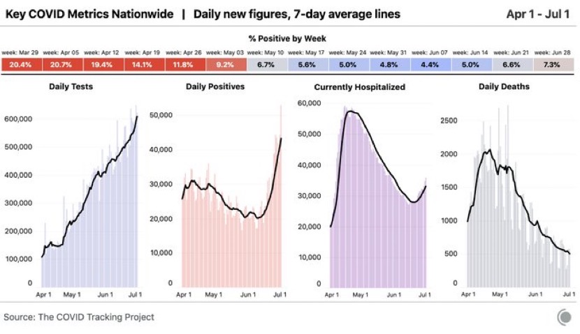
The COVID-19 outbreak is not one outbreak spread evenly across the US. It is many outbreaks spread unevenly. The same applies across Europe.
3 July 2020 (Chania, Crete) – The trillion dollar question. Why are COVID cases in the U.S. increasing while deaths seem to be decreasing? The answer is simple. It’s called Simpson’s paradox and it’s the result of incorrectly pooling data and arriving at a false conclusion. I have not written about COVID for awhile so I’d like to do a mash-up of two Zoom chats I was in over the last two days. All of the following notes and slides are from Miles Beckett / Silversheet / Crunchbase. My comments in italic.
If you lump the data and look at the US as a whole, you’ll observe: Cases are increasing, positivity rate is increasing, hospitalizations are increasing, and deaths are decreasing. Until recently, it also looked liked hospitalizations were decreasing and positivity was flat.
It would be rational to come to the following conclusions which are lathered across every media page:
• “Young people are getting it now, not old people”
• “We’ve gotten better at treating it, the death rate has fallen”
• “We’re testing more people, so we’re seeing more cases”
NOTE: I don’t “read” Twitter anymore. I use APIs that curate it for me so I only receive selected, summarized Tweet material that pertains to my research or reading need. It was suggested I curate for the three quotes above and found Twitter was awash with those statements.
Miles Beckett from the transcript:
There’s some truth to these conclusions. Yes, more young people than old are getting it (for now). Yes, we have gotten better at treating it (a little). Yes, we are testing more people and finding more cases (somewhat). But none of these conclusions explain the effect.
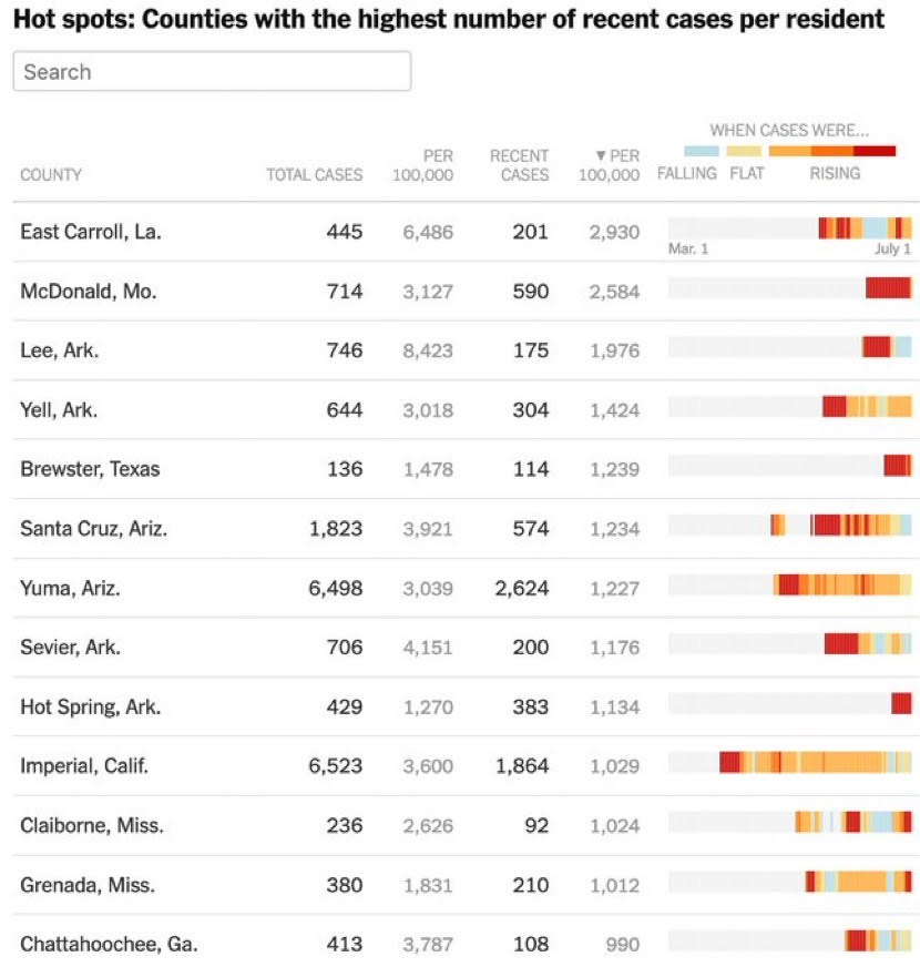
Here’s the truth and I have written extensively about this. The COVID-19 outbreak, is not one outbreak spread evenly across the US. It is many outbreaks spread unevenly. You need to look at state data, or better, county data to really understand what’s going on. The same applies across Europe. Do not look at aggregate country data. Look at individual provinces and regions (I will address Europe in a subsequent post).
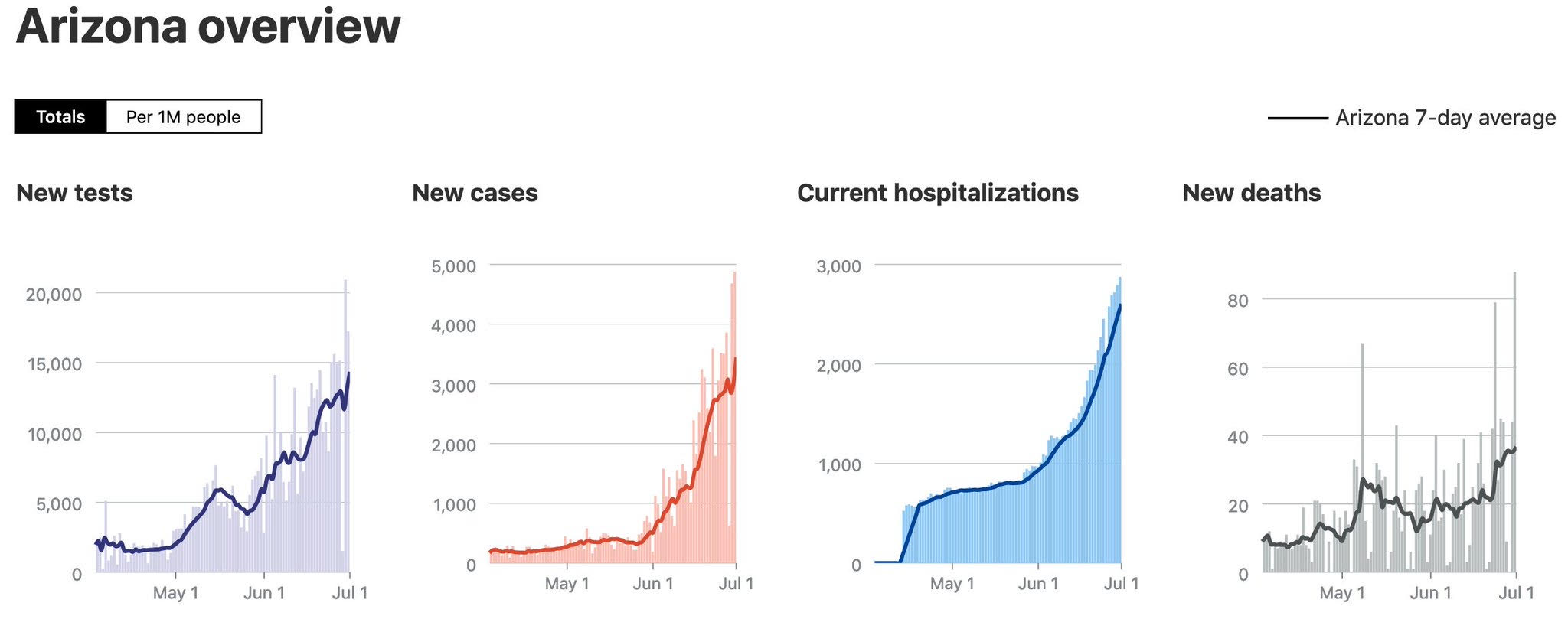
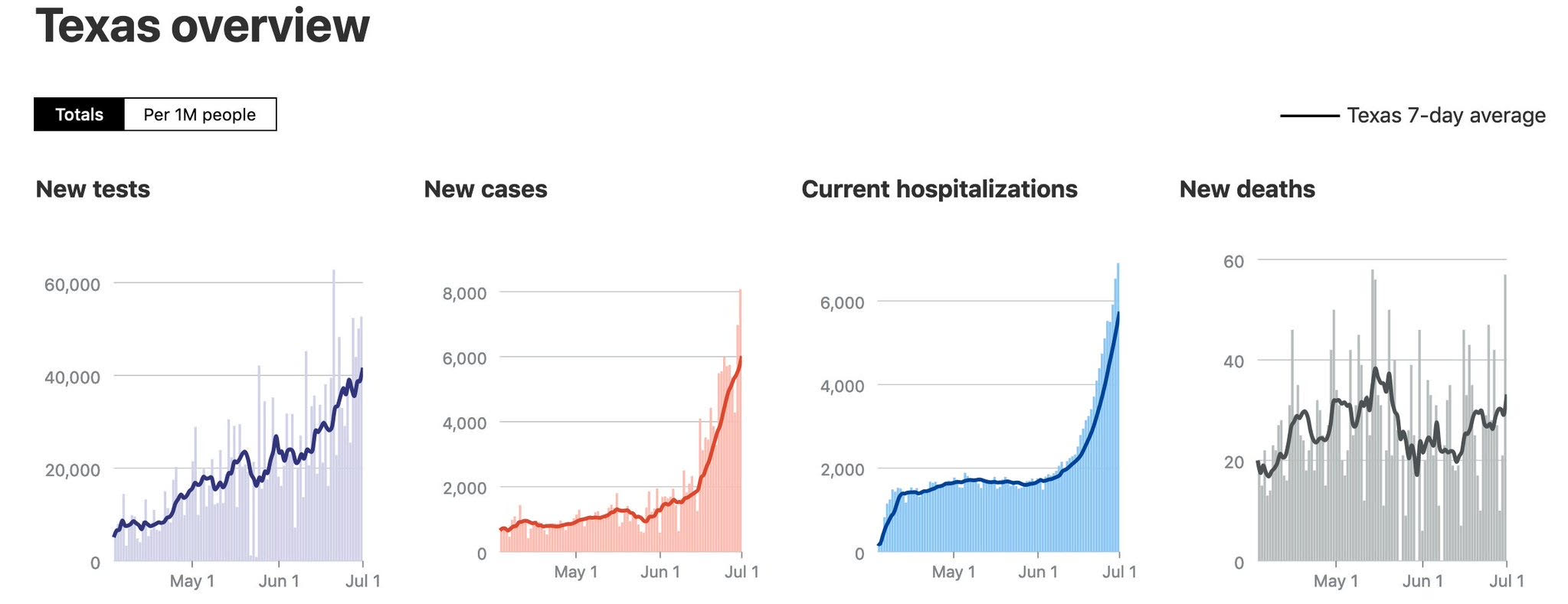
Let’s take just two examples, Arizona and Texas.
Cases and deaths have both been increasing for weeks. Florida looks similar (except Florida data simply sucks, so it’s hard to analyze precisely, and that’s a political issue). If you count in Miami data and Houston data, it’s much worse.
This is the heart of Simpson’s paradox. If you pool data without regard to the underlying causality, you’ll get erroneous results. It is especially encountered in medical-science statistics and is particularly problematic when frequency data is unduly given causal interpretations. The paradox can be resolved when causal relations are appropriately addressed in the statistical modeling. The following video does an excellent explanation of the paradox. And it emphasises that without understanding the underlying causal context of statistics you can use statistics to misinterpret – or blindly lie:
The truth is simple, and horrifying. We are about to have dozens of NYCs around the country. The next 8 weeks are going to be brutal, no matter what we do. ICUs overflowing, ventilators rationed, thousands of deaths.
The bottom line: although it’s erroneous to make firm conclusions on decreased mortality from overall data, these conclusions indeed explain the effect and address the causalities like better treatment in areas of newer outbreak, and the spread in younger population. It is all in congruence with Simpson’s paradox
Unfortunately, the virus is still here and we’ve failed to manage it with mis-step after mis-step since the beginning. And I think fear dramatically increases the perception of the number of deaths. It reduces the imune system. I think people need to realize that the pandemic is not all that is said on TV, and they need to read, relax in their knowledge and increase their defenses, strengthening their imune system. High morale is a powerful medicine.
I have no agenda in any of this. I’m just an an opsimath trying to get a grip on current times.


Thanks for sharing this. Much easier for Google to find it than the original Twitter posts.
How exactly is this an example of Simpson’s Paradox? I don’t see it. Simpson’s Paradox is when a trend in two or more subcategories is reversed when the categories are combined. If I understand what you’re trying to say, the trend runs in different directions in the categories (states). But perhaps I’m misunderstanding. Please spell it out with the categories and numbers/rates for those categories given explicitly.
I’ll respond to this. I need get a few other thing off the deck first.
Have you given this any more thought? I like to collect examples of Simpson’s Paradox for student projects. Thanks.
Seconding Darci’s request. I’m what you might call a “fan” of Simpson’s Paradox — I’ve even taught it in stats classes — but I’m unclear on how it explains the COVID cases/deaths divergence. By the way, here’s a nice post about how Simpson’s Paradox relates to a rather different aspect of the pandemic: its disparate racial impact.
http://causality.cs.ucla.edu/blog/index.php/2020/07/06/race-covid-mortality-and-simpsons-paradox-by-dana-mackenzie/
Thanks, Glen. This is a great example and discussion of how to interpret Simpson’s Paradox.
Dear Glen,
I also sometimes teach Simpson’s Paradox. In the early 2000s, my university had a pretty good men’s basketball team and one of the players was in a class in which I was teaching Simpson’s Paradox. This led to a fun little project. scroll all the way to the bottom to find three Simpson’s Paradox links.
http://www.math.kent.edu/~darci/research/
Apart from Dana Mackenzie’s insightful blog post, you may also find our earlier work pointing out Simpson’s paradox in age-stratified CFR across different countries interesting: https://arxiv.org/abs/2005.07180